It looked perfect on your machine: fonts, annotations, and the other-computer problem
Why a PDF renders differently on another computer — non-embedded fonts, annotation-hostile readers, form quirks — and the fixes: embed, flatten, test.
UnboundPDF is a free suite of 54 PDF and image tools that run entirely in your browser — merge, split, compress, edit text, OCR in 126 languages, redact, sign, convert and archive to PDF/A. Your document is read and written by the page on your own device; there is no document-upload endpoint in the core tools, no account, no watermark and no daily cap. Every result can be checked — with the Network tab, or with the Document Passport the Workspace writes for a chain of steps.
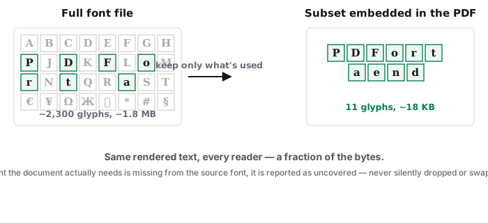
The short answer. The parts of a PDF that vary across machines are the parts the file left to the reader: fonts it did not embed and annotations the reader must draw. Embed fonts at export, and flatten what must not move — those two habits end almost all of it.
Suspect one: the font that stayed home
A PDF can reference a font instead of carrying it. On your machine — where the font lives — everything is perfect; on the recipient's, their reader substitutes the nearest thing it has, and spacing, line breaks and occasionally whole scripts shift. The fix is upstream: export with fonts embedded, and for non-Latin scripts especially, check — the fonts deep-dive shows what goes wrong and where.
Suspect two: annotations at the reader's mercy
Comments, highlights, form entries and placed signatures are instructions the recipient's reader interprets — and readers differ: some hide comment types, some render form text oddly, some print annotations differently than they display. Anything that must look the same everywhere should stop being an annotation: flatten it into the page before sending.
The permanence ladder
Casual documents: embedded fonts and a flatten are plenty. Documents that must render identically in a decade — filings, theses, archives — climb one rung to PDF/A, the profile that requires self-containment outright, checked here against our published PDF/A-2b rule list.
Troubleshooting
The recipient sees blank boxes for CJK or Arabic text. The font was not embedded; re-export with embedding and reconvert. "Your form came back empty." Their reader hid the unflattened entries — flatten and resend. It prints differently than it displays. Same root causes; the flattened, embedded copy prints as it looks.
Frequently asked questions
Isn't looking the same everywhere the whole point of PDF?
It is — when the file is self-contained. The format allows non-embedded fonts and reader-drawn annotations, and those are exactly where sameness breaks.
What's the quick fix for a form or reviewed document?
Flatten before sending: entries, signatures and comments become page content and render identically in every reader.
And the thorough fix?
Self-containment: fonts embedded at export, and PDF/A when the document must hold for years.
Try it yourself
Free, private, no account. Runs entirely in your browser.